Wednesday, September 5, 2012

Blending Assignment

I had a bit of trouble with this assignment as I am not very experienced with photoshop, but tried my best to achieve these results.

Creating Water Droplets

Blending This Guy Into A Crowd

Faking Fog/Mist

Blending An Explosion And A Air Plane INto A Scene

Thursday, May 31, 2012

Printer Calibration

 Final Products that emphasis the difference between the two types of papers used

Types Of Paper Used;

Photo Paper Plus Satin
Photo Paper Plus Glossy II


Through out this process I had a few difficulties with one of the printers as it would print as it kept saying there was no paper loaded (when there was), which was strange. After swapping everything seemed to run perfectly which was a relief. I was unaware/forgot that at the time that we had to swap computers to scan the color chart (as only two computers in the room only had the other version of the eye1 calibration application). A few hours later I ended up with me final result of the prints being correctly calibrated. Though my prints compared to the mater prints (them being Brians) had a silghtly browny color to it, this said the prints had full tonal ranges in the charts (pictured above). I am quite pleased with the final product, where I compared that the before and after look completely change.


  Color Chart (used to scan into the computer and calibrate the printer)

Tuesday, May 29, 2012

Calibrating A Computer Screen 3

I was pretty happy with the final result of the screen shot. As you can see the temp, luminance and gamma are in a straight line with each other.

Color Temperature;
Target; native
Current; 6200

Gamma;
Target; 2
Current;2

Luminance;
Target; 120.0 cd/m2
Current; 136.2 cd/m2
Minimum; 0.1 cd/m2

Ambient Light;
Color Temperature; 7200 k
Illuminance; 46 Lux

As you can see the goal was to achieve the closest result to the target, which was achieved (apart from the luminance which is a bit off).

Tuesday, May 8, 2012

Ageing A Photograph

After 


Before (Original)


Steps On How To Age A Photo.
This is about taking a modern photo, making it look old. Results may vary depending o your definition of how an old photo appears. A lot of the old cameras didn’t pick up many of the shadows and highlights as with today’s modern camera. Firstly You need to create a new layer of you can work non destructively. To create an old photo image>adjustments>levels, output levels slightly drag to the right to about 43. This sucks out the shadows of the image. To give the image the authenticity of an old image image>adjustments>hue/saturation it is a colourised overlay. Click on colourise in the bottom right hand corner, your aim is to create a sepia type colour [hue;33, saturation;27, lightness -11] and press ok. Filter>noise>add noise, this is to add a bit of speckle [amount;9, ensure that uniform and monochromatic is checked off] click ok. Hold down alt/option key and press delete to create a white background, make sure white is your support colour [white as your foreground and black as the background colour]. Filter>render>fibres, your are looking for a little bit of white and a lot of black where the white is going the act as the scratches [variance;4, strength;35, for just a few scratches] click ok. Make sure layer 2 is selected, click on where it says normal [side pallet – right hand side] then select screen, basically hides all of the black. This creates a scratchy effect. Just decrease the opacity a little bit to show less scratches.


Notes
As mentioned in my step by step process, I didn't mention on the actual presentation is that when you begin each process you need to create a new layer for each step. This is so you can go back and alter particular processes with out affecting the other steps.


Reference
http://www.wonderhowto.com/how-to-age-photos-photoshop-221859/

Tuesday, May 1, 2012

HDR

HDR
End Product.


                                                                        Single Shot
                                   (What it would have looked like without the use of the HDR)


For my HDR (High Dynamic Range) shot I originally wanted to photography the jetty on a lake which was down the coast. Though due to weather difficulties I wasn't able to complete. This said I photographed this building located on the highway behind CIT, at sunrise. A collection of roughly 25 images were used to gather the blow out and the darkness of the images to obtain more detail. I am quite happy with the result as I have the detail within the shadows whilst maintaining detail in the bright barts of the image.

Tuesday, April 10, 2012

Colour Management - Research Questions

1. What is the purpose of colour management?

Color Management is a process where the colour component for every devices in the imaging sequence. This is known to accurately control the colour replication. It occurs 'behind the scenes' and doesn't need any interference.

2. What problems make colour management necessary?

It is necessary as not all devices display colour in the same way. For example if you take a photograph and then transfer the image through the computer and them commence to print the image off, if it isn't calibrated then the colour profiles can be out of sync. Meaning that the colours on your camera are shown in a difference luminance range compared to either your camera or printer. Which will result in your colours looking different in all three (camera, computer, printer) meaning the blues may look more greenish in one and not the other.

3. What are the components of a device profile (i.e. what information do the contain)?

Color profile is a file that communicates the color characteristics of a specific device while it's in a particular state. Profiles can contain extra information defining viewing conditions or gamut-mapping methods. Effective with your computer's color management system, color profiles also ensure that the color content is appropriately rendered, regardless the device or viewing condition.

4. What is the difference between a device profile and working space?

Device Profile; Manages the colour gamut of screens, printers, scanners & cameras.

Working Space; A colour gamut not specific to any device like adobe RGB, sRGB, and pro photo. These are specific to the confines of colour and are sourced from larger gamuts known as colour space

5. What is a 'reference colour space' and how are they used?

Reference colour space is a device independent based on colour space. Most current CMSs use a CIE-defined color space, such as CIE Lab or CIE XYZ. You never have to work directly with the reference color space; it's the theory behind how the software works. Think of it as the common ground for all color devices—a space that can represent any colour.

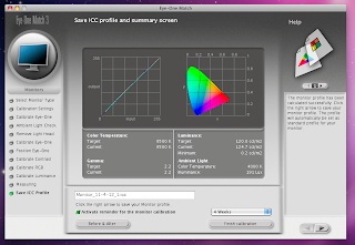
6. What is the difference between 'calibrating' and 'profiling' ?

Its the manual adjustments you have to make i.e. adjusting contract, brightness on the devices. A profile provides information made by the calibration process for each device that is used.

7. What is rendering intent?

rendering intent determines how a color management system handles color conversion from one color space to another.

8. Which rendering intents are most useful to photographers, and when would you use each of them?

Photographers always use relative or perceptual intent, as for everyday images, absolute causes colour cast whilst saturation produces unnatural colors. Relative intent handles out-of-gamut by burning these colors to the edge of the gamut, leaving in-gamut colors unchanged, while perceptual intent smoothly moves out-of-gamut colors into gamut, preserving gradations, but distorts in-gamut colors in the process. If an entire image is in-gamut, relative is perfect, but when there are out of gamut colors, which is more preferable depends on a case-by-case basis.


References;

http://en.wikipedia.org/wiki/Color_management
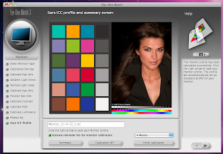
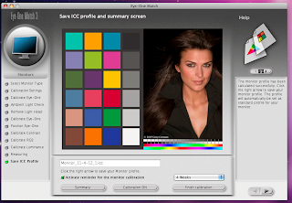
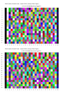
Calibrating & Profiling A Monitor 2

With the second profiling of a LCD monitor I wasn't able to use the same computer as it was missing the initial software to complete the task. That said this time I had no difficulties using the equipment as I did with the first time (where is kept dropping out of service).


Target Settings;
Colour Temperature 6500
Gamma 2.2
Luminance 120


Before & After Comparisons;

With the before and after comparisons you can't really tell that there is any different or variation with the two. This is to be expected as it has previously been calibrated and the vastness will become less each time.

Tuesday, April 3, 2012

Stitched Image


With this project I decided to shoot my back yard, with this the weather was a bit over cast. The total amount of images to stitch together was roughly 14, this in mind I mover the camera slightly each time so I would have a fair amount of over lap.


The below images are my screen (left) and j peg (right) versions


Tuesday, March 6, 2012

Calibrating & Profiling A Monitor

End Result.

Through this process I had a bit of trouble of the eye one device staying connected to the application, though if worked out in the end. In the calibration process the blue was out alot, and had to correct it as for the other two the Red & Green were close to the objectives. The end result was a success as the line is completely straight instead of all the colours going in every direction.


Target Settings;
Colour Temperature 6500
Gamma 2.2
Luminance 120


Before & After

I am not sure if you can see the difference on the screen, though after the calibration process was vastly different. Where the before was flat and discoloured.